DESCRIÇÃO DO PROJETO / PROJECT DESCRIPTION
"Este projecto, enquanto primeiro espaço de uma nova marca de venda a retalho de calçado, pretendia essencialmente a criação de uma identidade, através da interpretação do nome, da linha/segmento de produtos a comercializar e do público alvo.
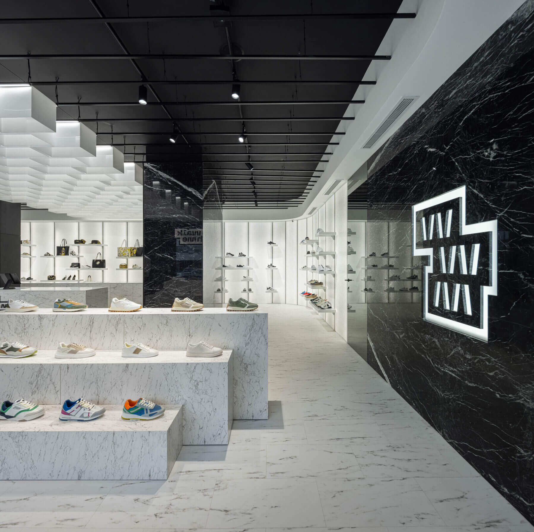
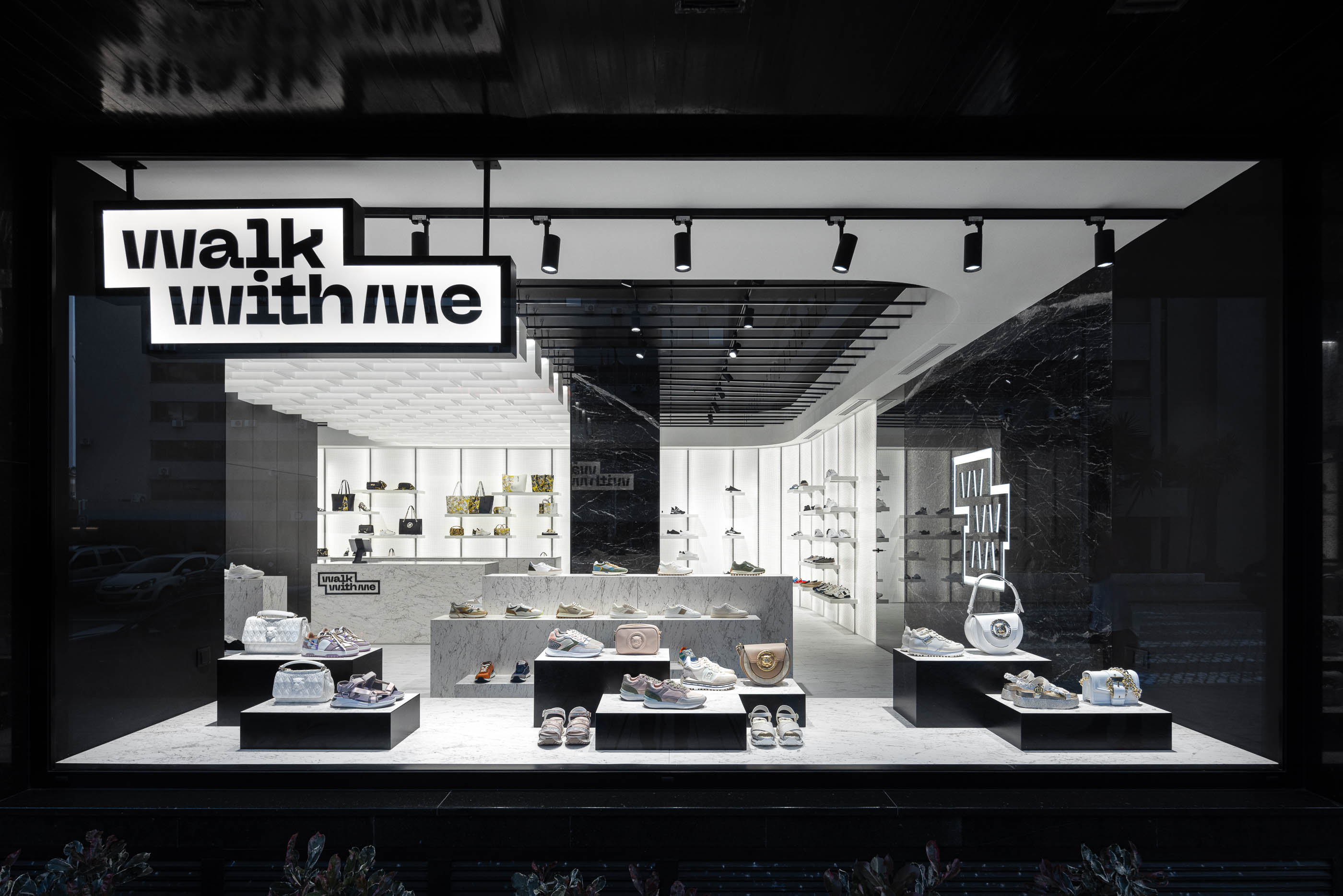
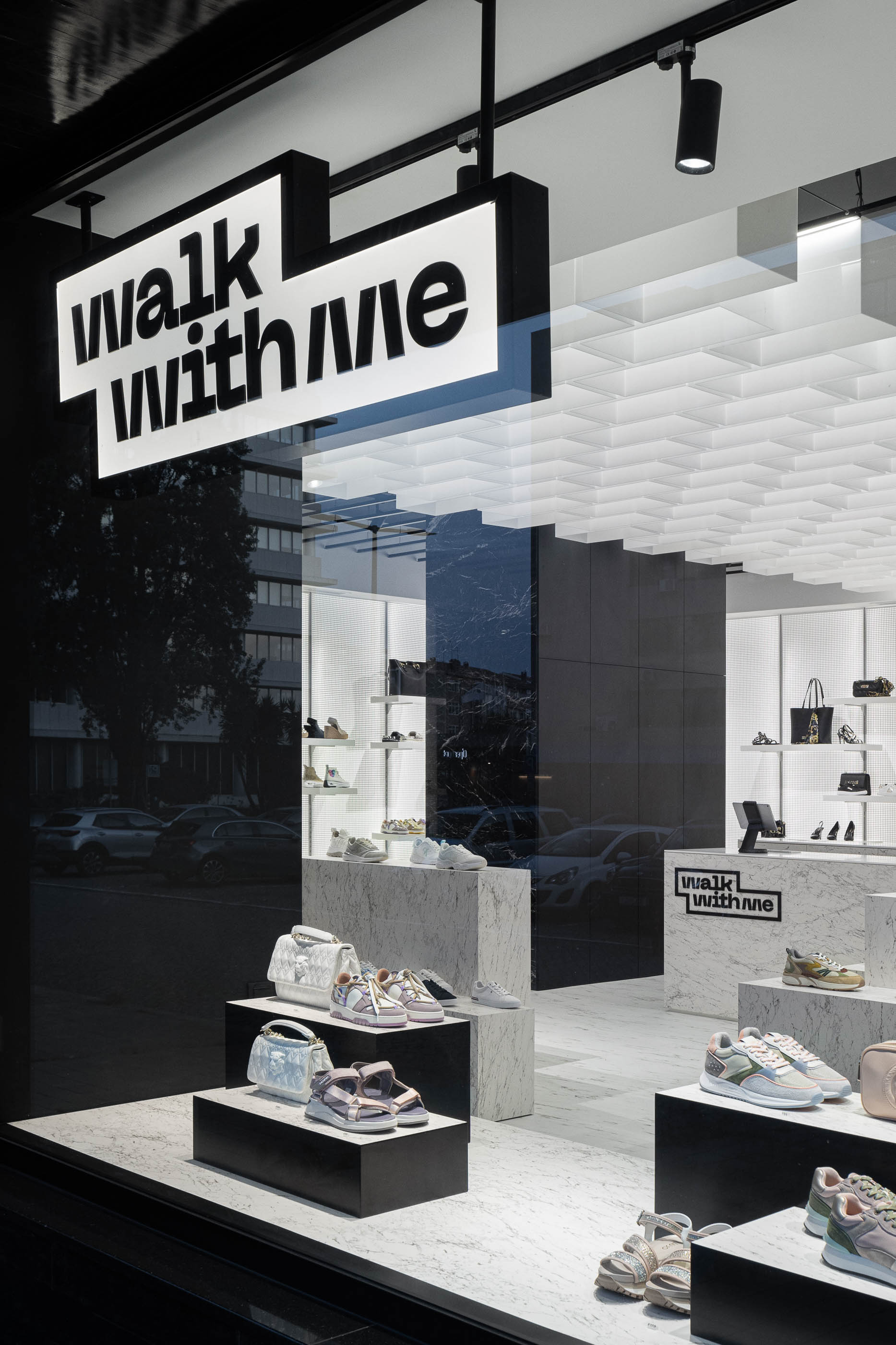
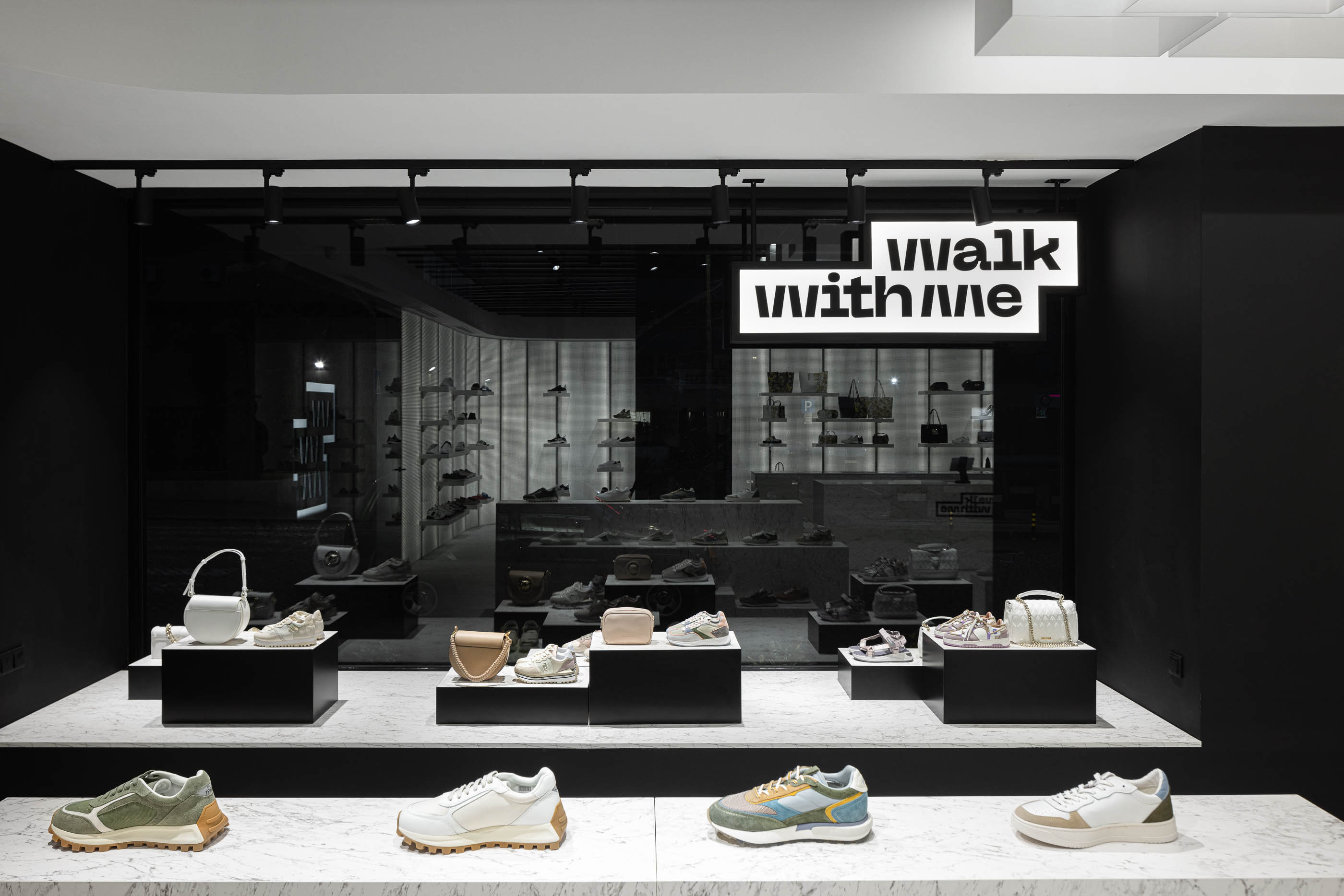
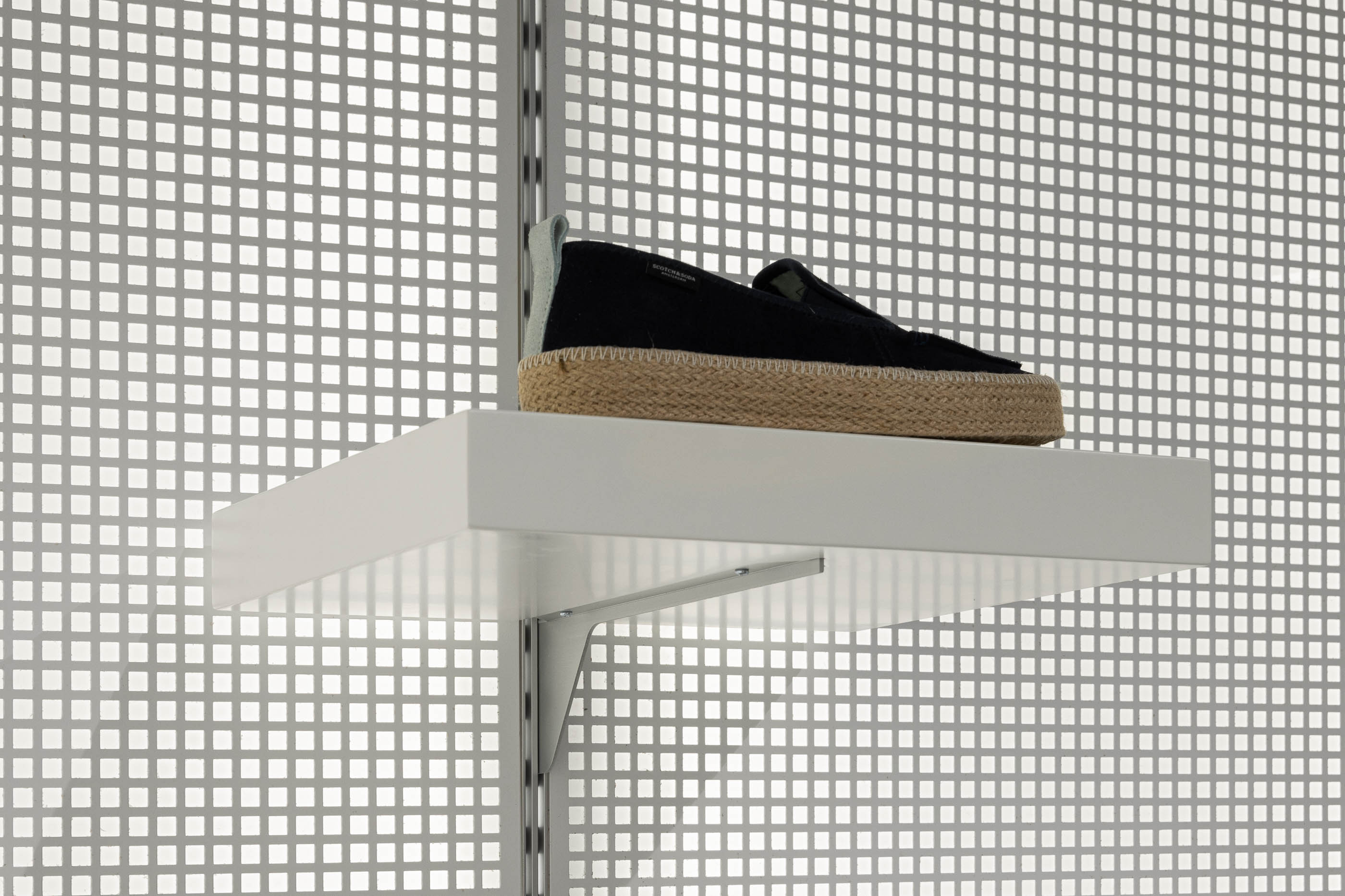
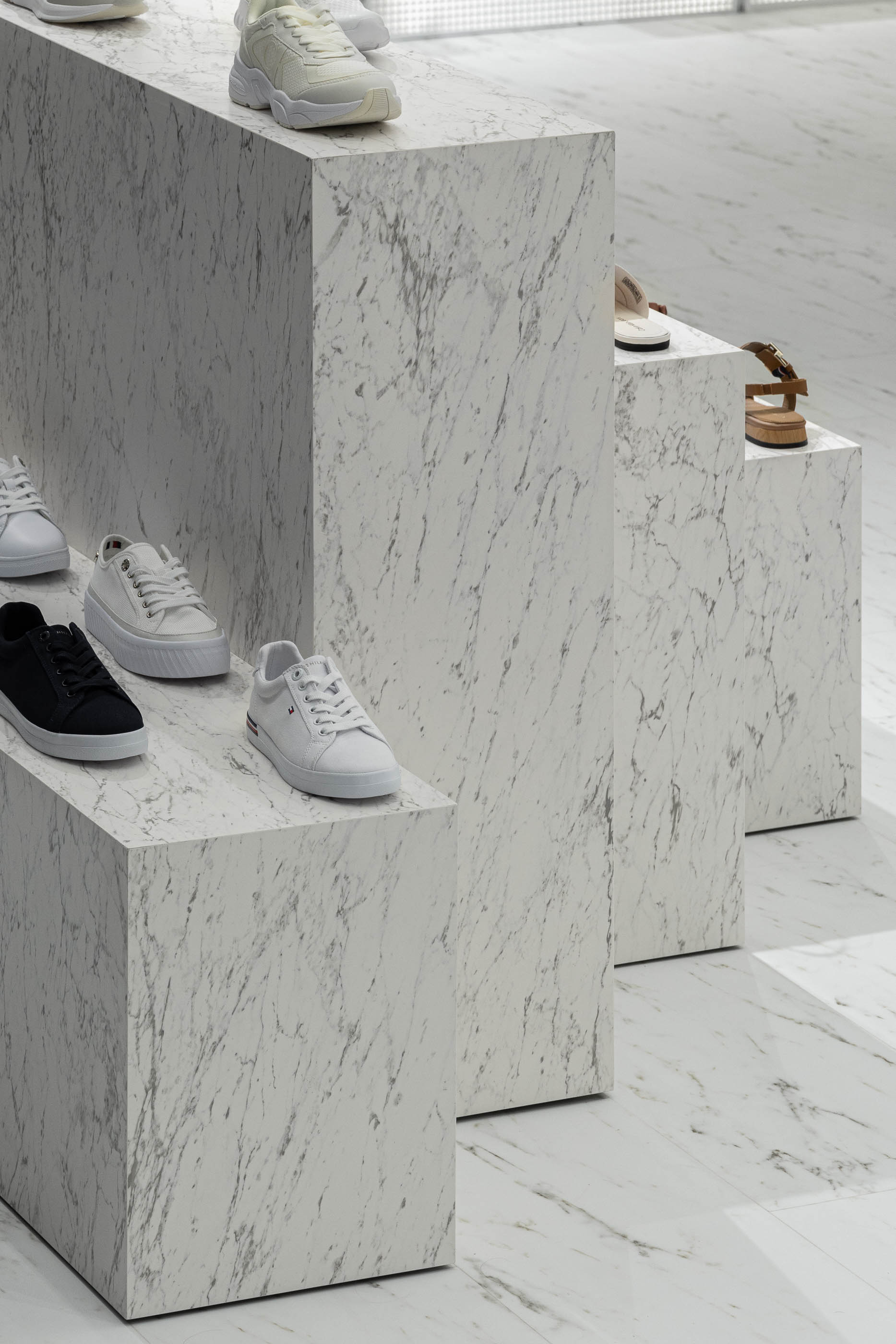
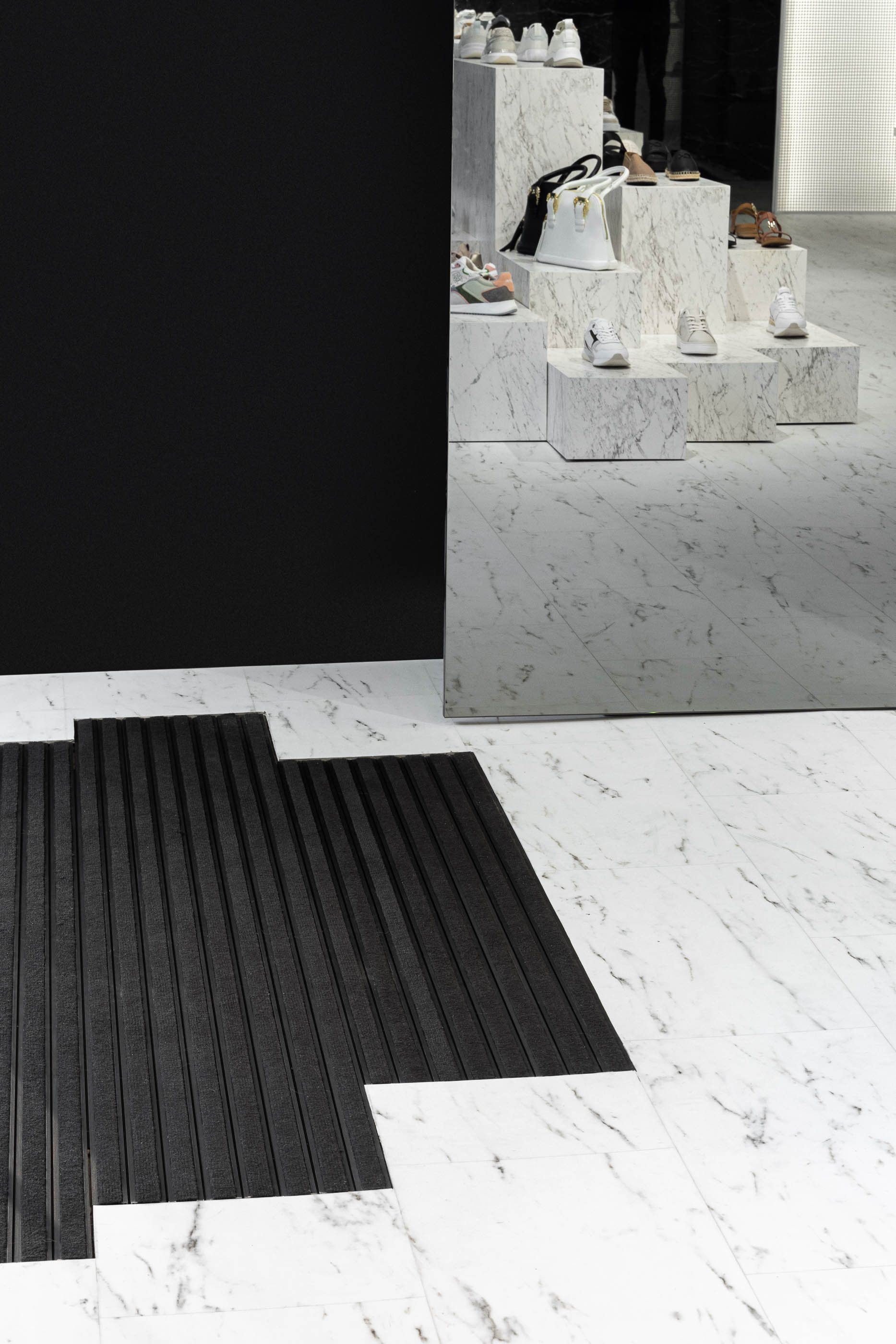
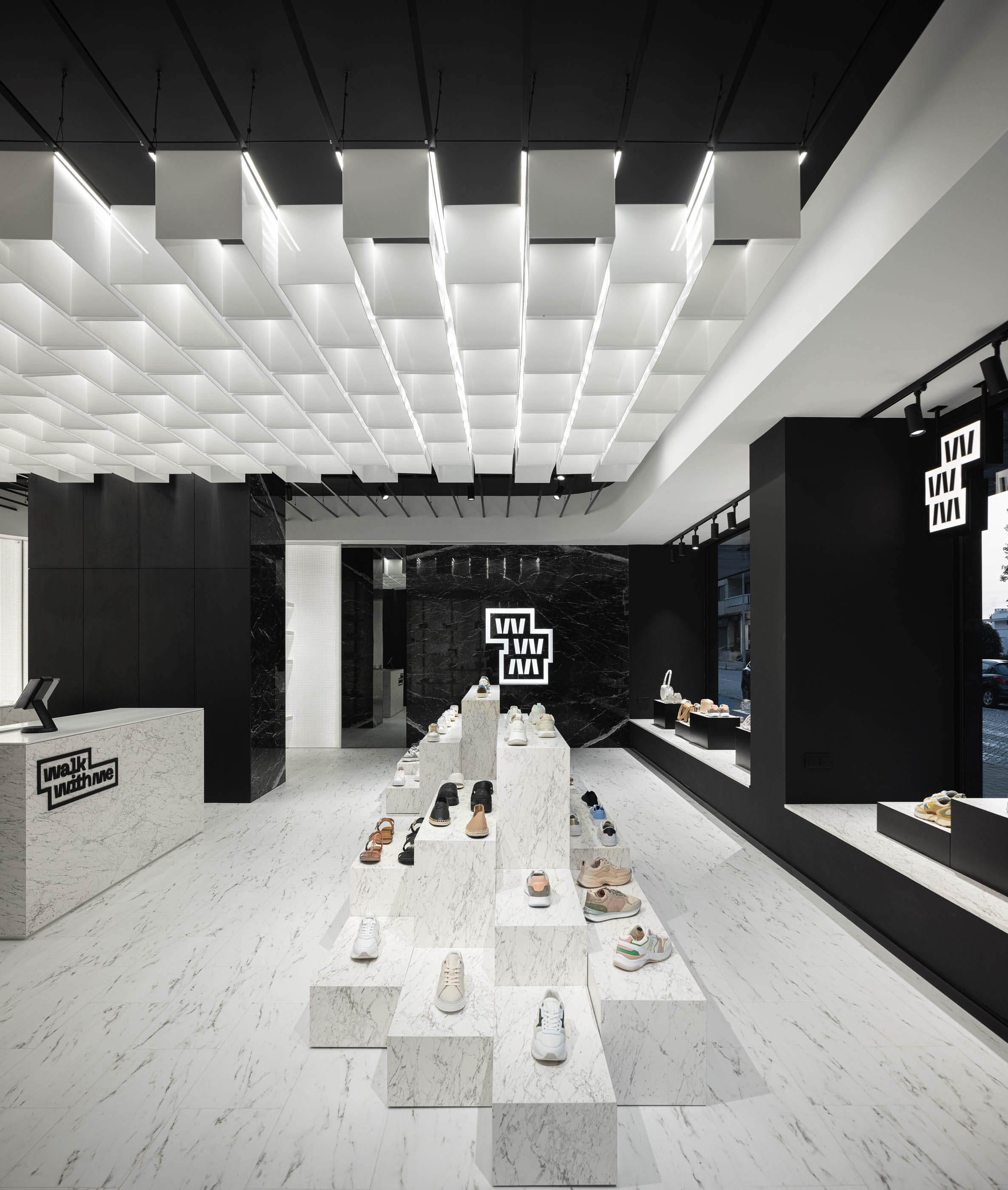
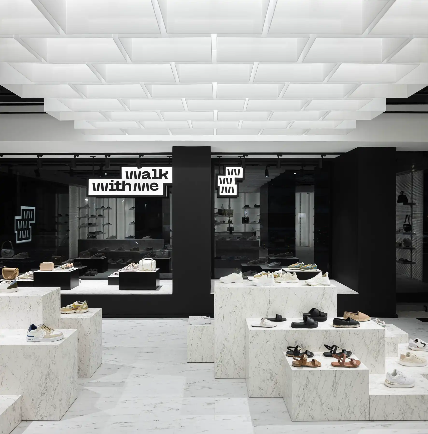
O nome “Walk With Me” levou-nos a explorar composições daquilo que é a base do “andar” - O pavimento, e a sua estereotomia, que se tornou a essência do conceito estético-espacial. Partindo desta premissa, estudamos a estereotomia do pavimento cuja métrica permitisse dar origem aos elementos expositivos. Estes elementos, enquanto base para exposição de produto, são um alto relevo da dimensão de cada peça de pavimento (com alturas diversas), possibilitando várias composições mediante quantidade de produto a expôr e/ou novas coleções.
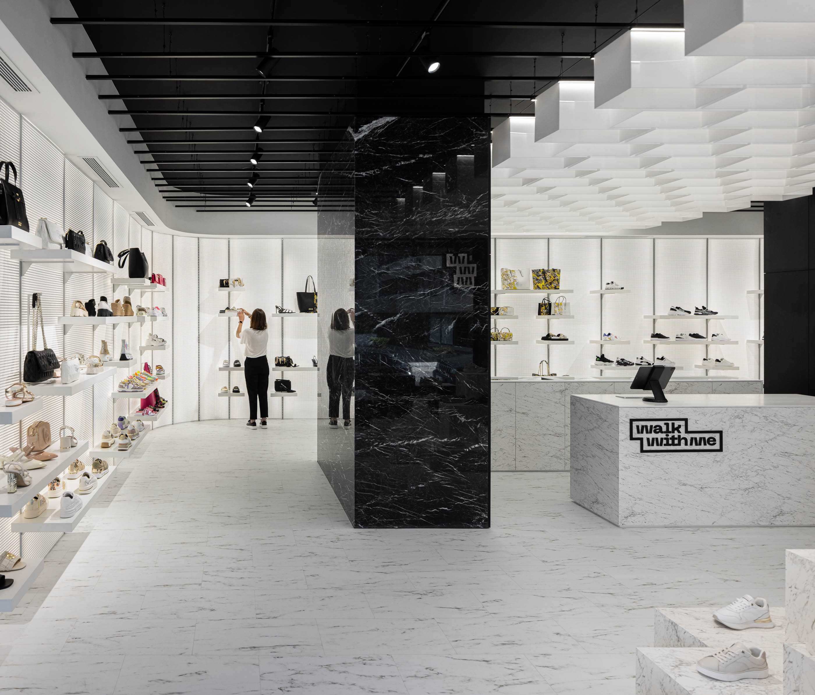
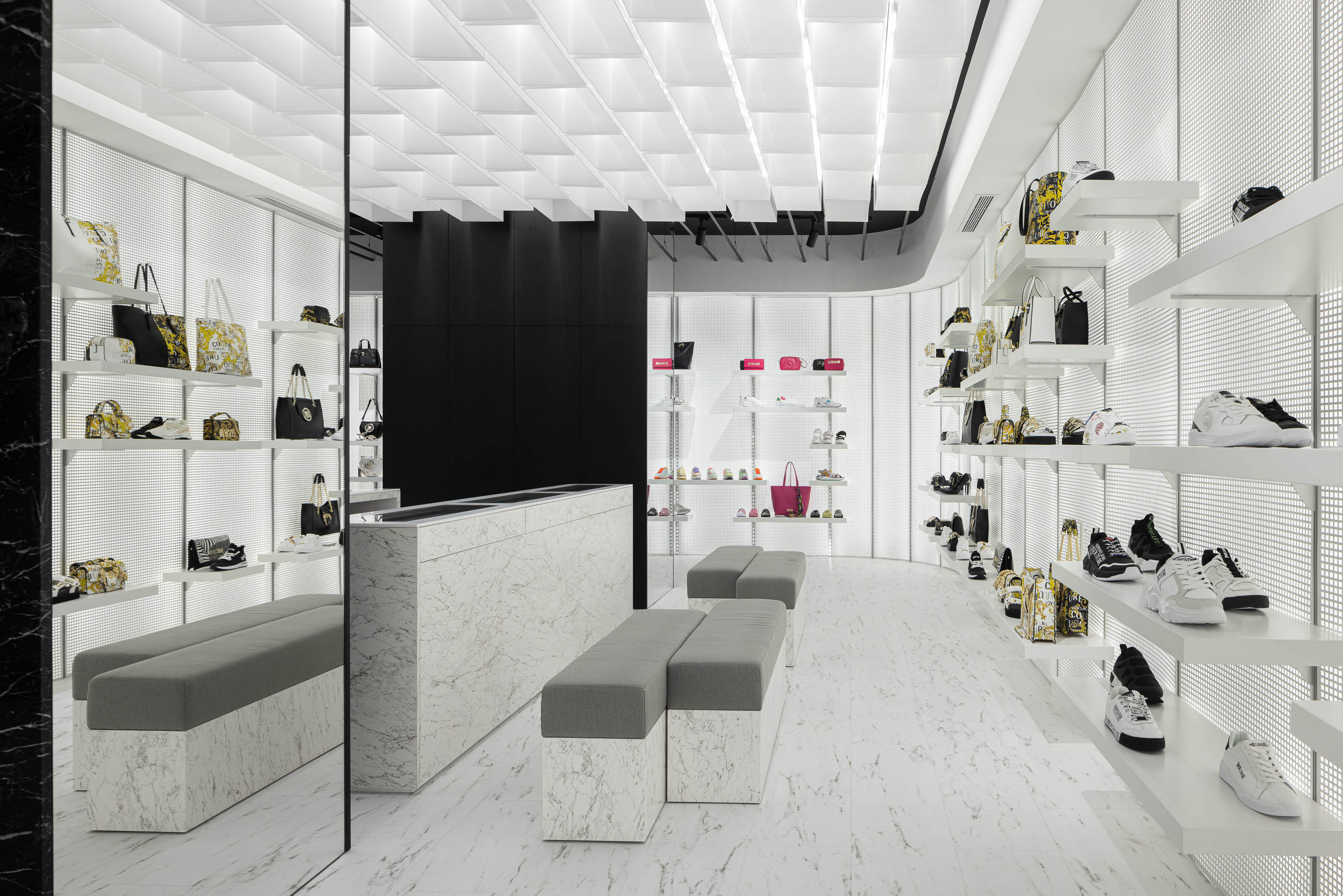
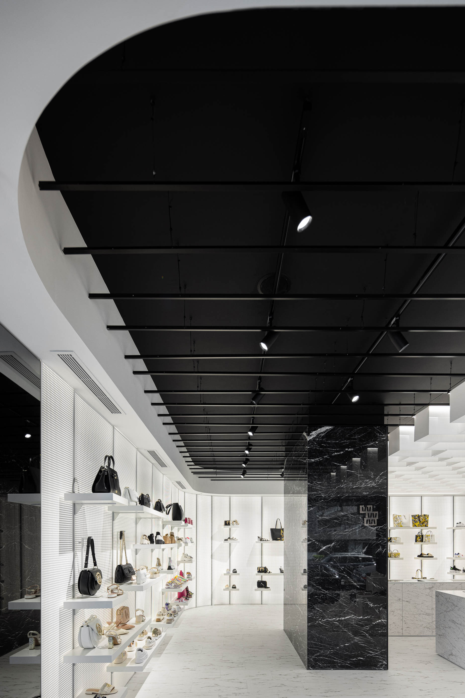
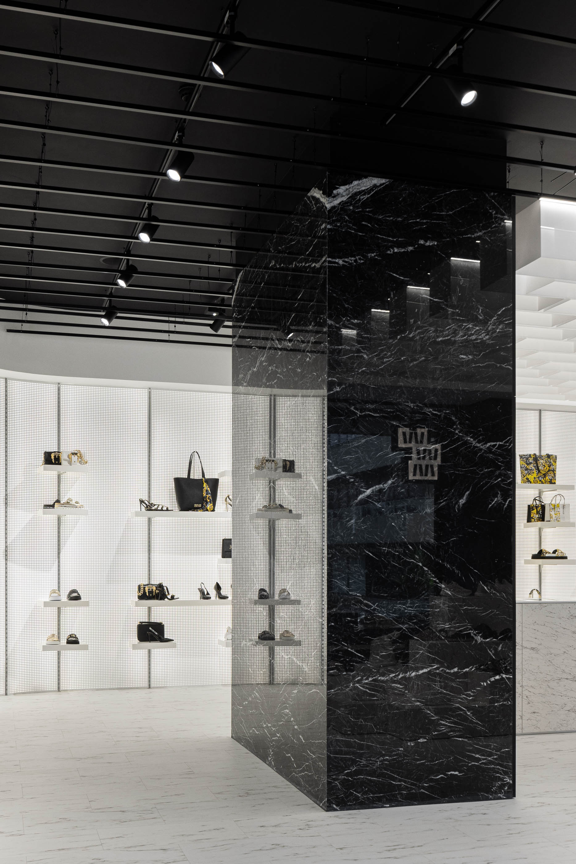
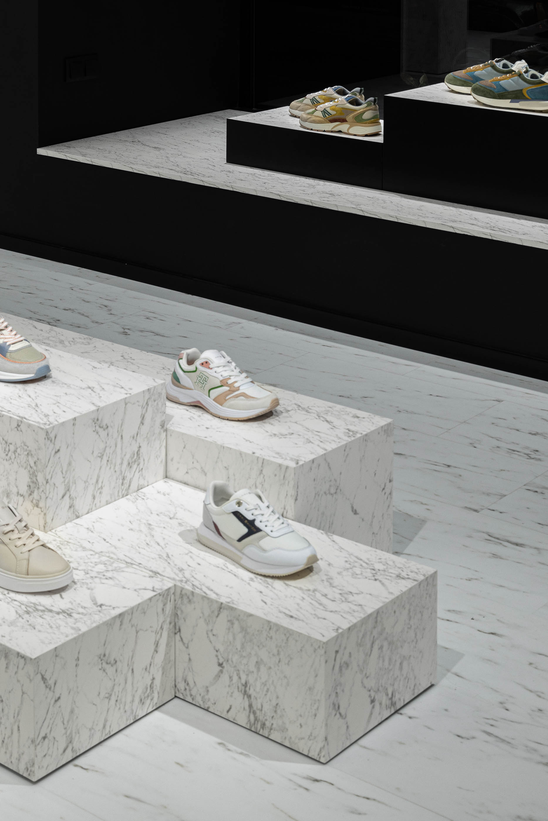
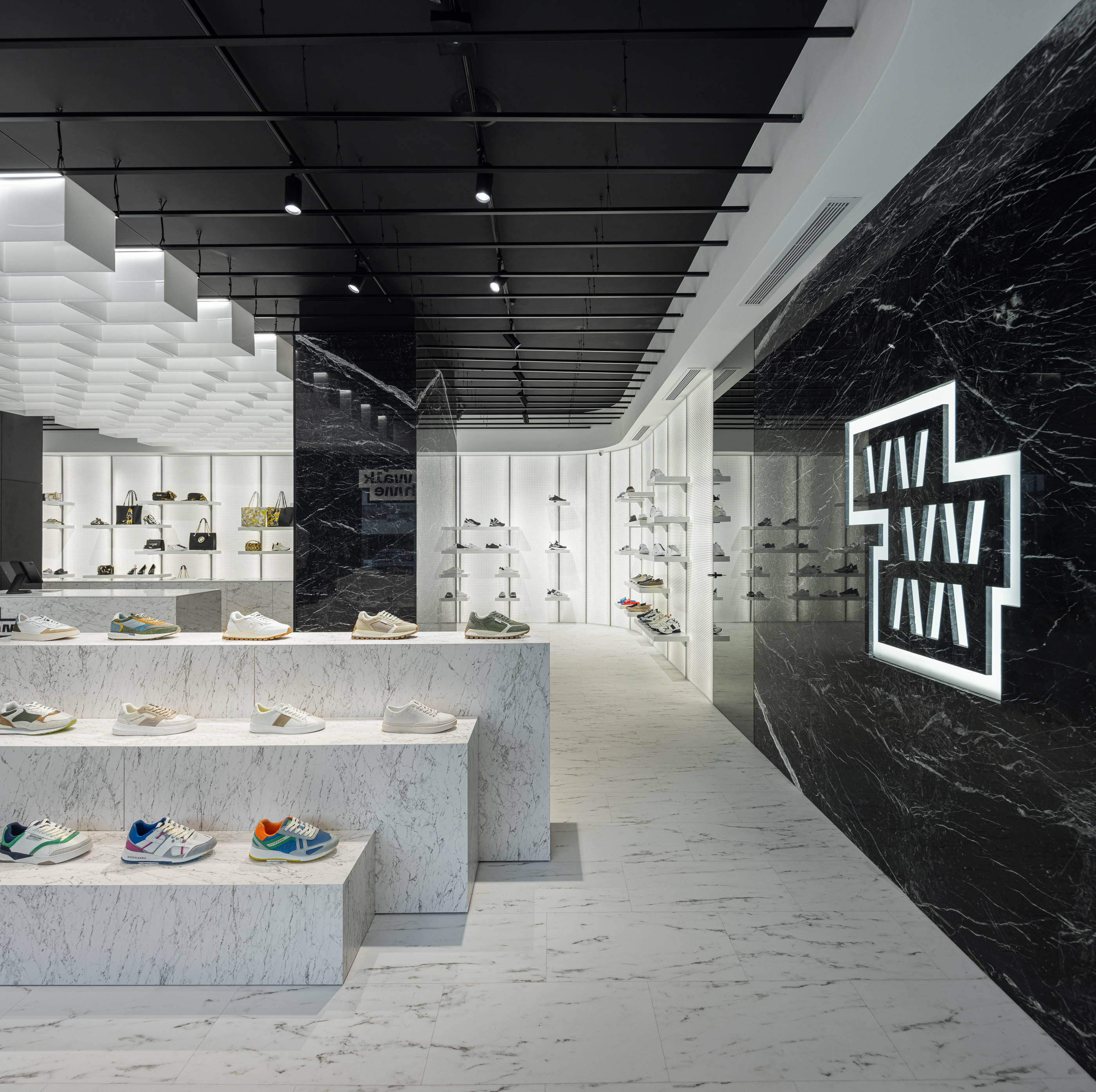
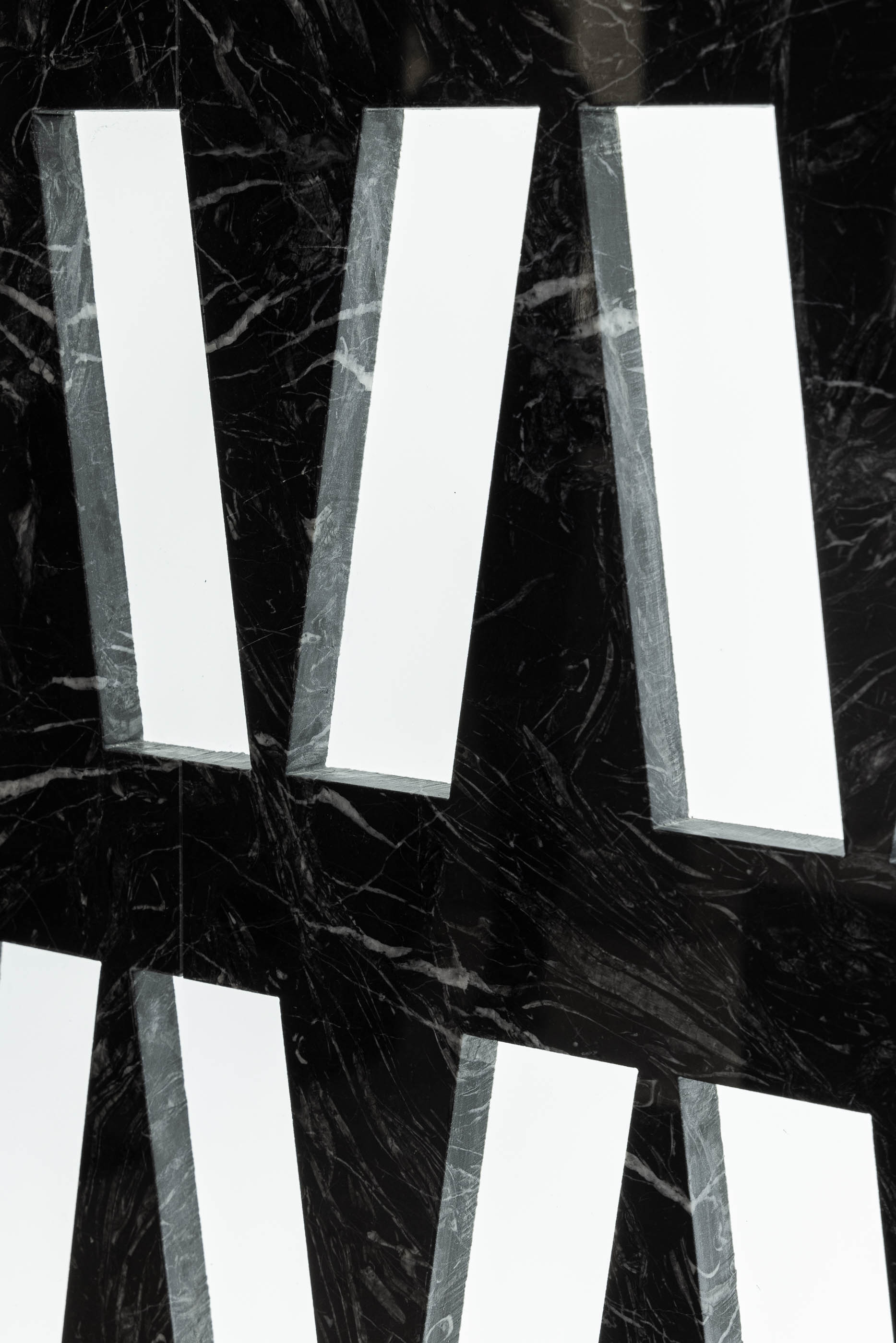
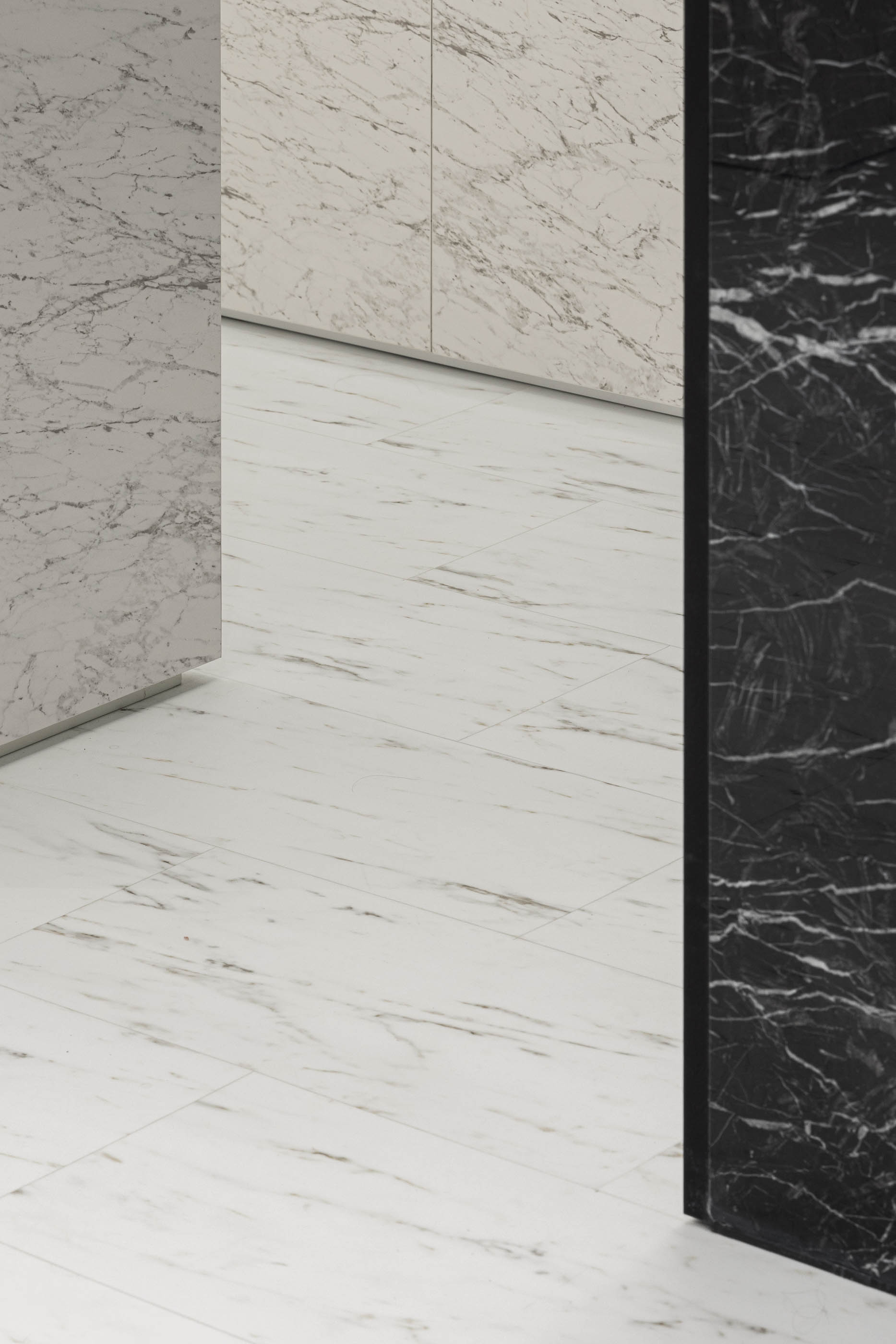
A definição cromática e matérica do espaço, é sugerida pelo logotipo da marca, em que exploramos materiais pétreos pretos e brancos, através de texturas de mármore calacatta e marquina. Esta dualidade cromática permite que os produtos tenham natural destaque no espaço, enquanto elementos compositivos do mesmo. O branco está sempre associado ao produto, e por seu lado o preto está associado às zonas/partes/elementos “estéreis” da loja.
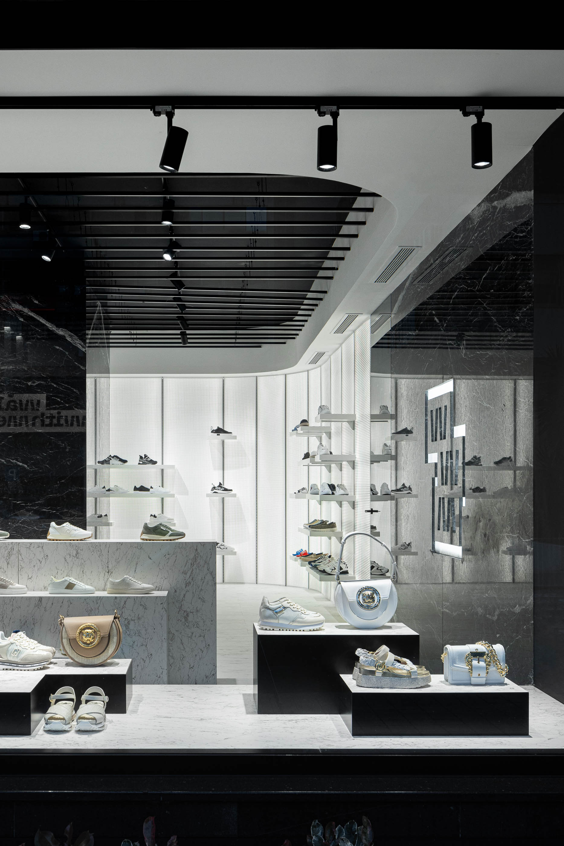
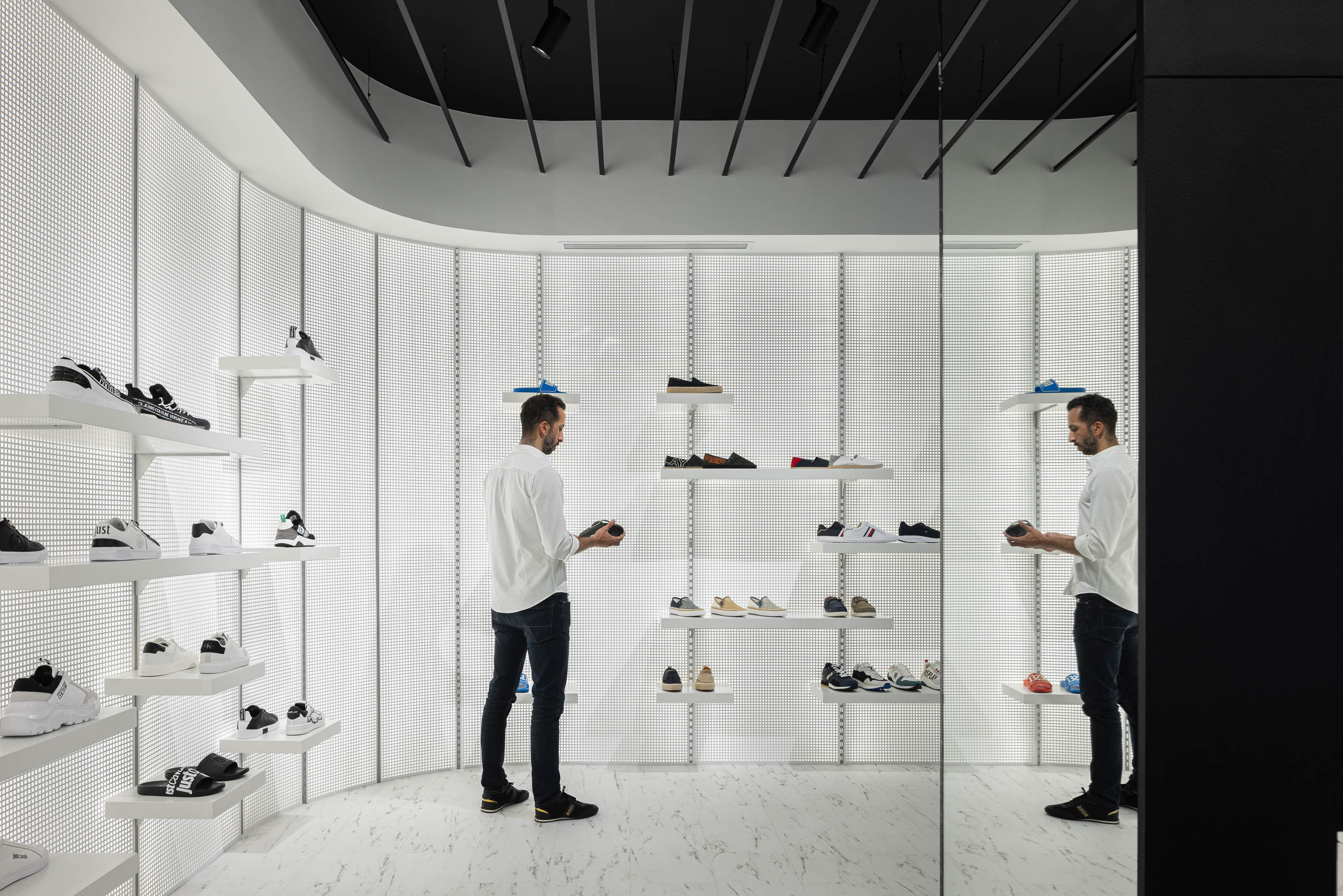
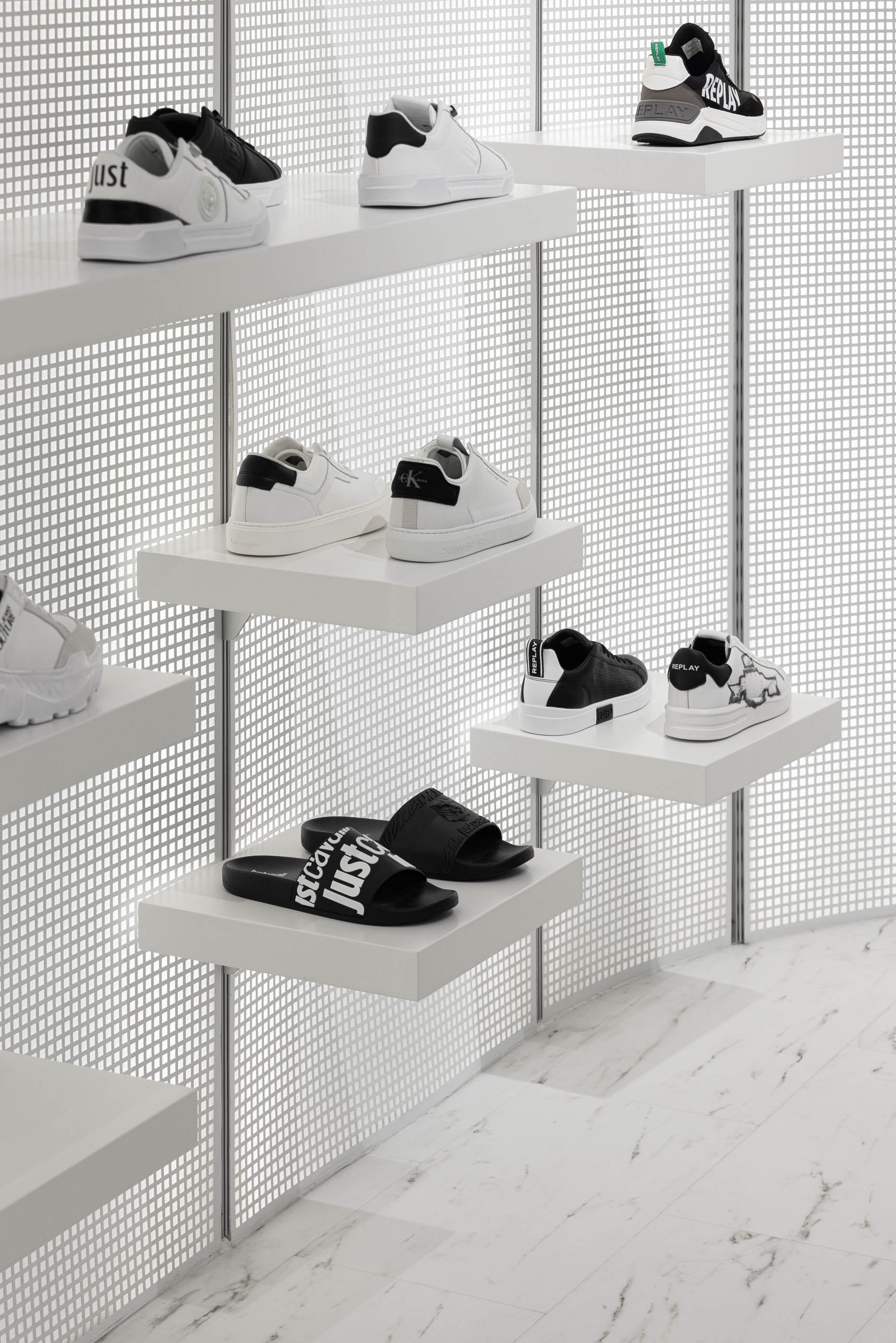
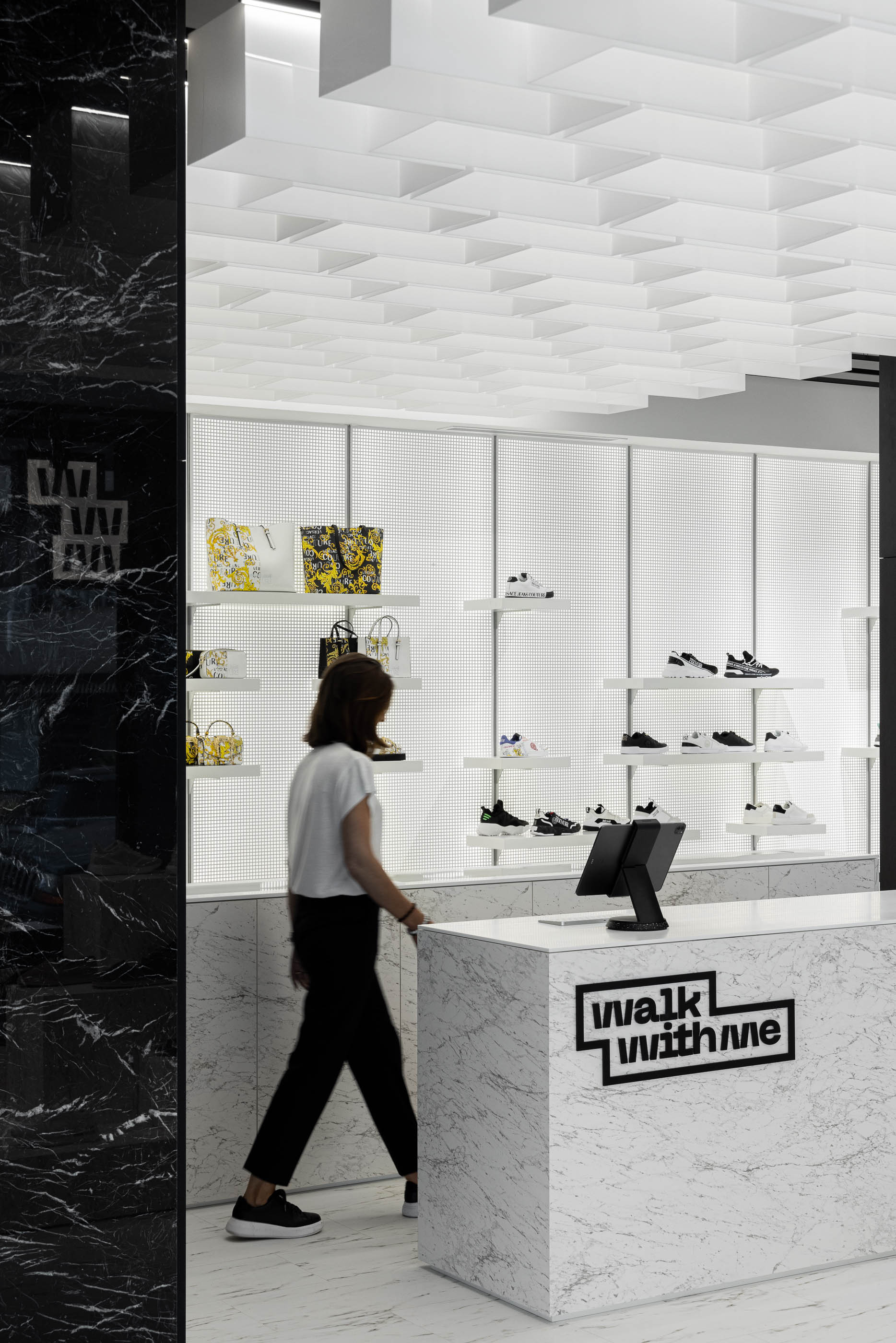
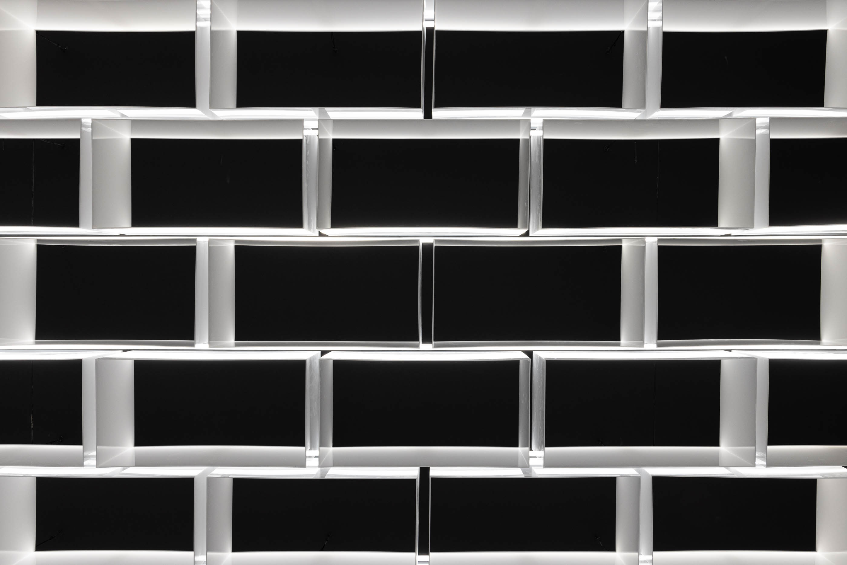
O critério para a exposição de parede passava por um sistema que também permitisse diversas composições, mas também iluminar os produtos de forma homogénea, pelo que propusemos painéis retro-iluminados compostos por acrílico opalino branco e chapa perfurada. Foram definidas duas tipologias de estante para este sistema, “single” e “tripla”, permitindo diversas combinações nas triplas e destaque de produto na single.
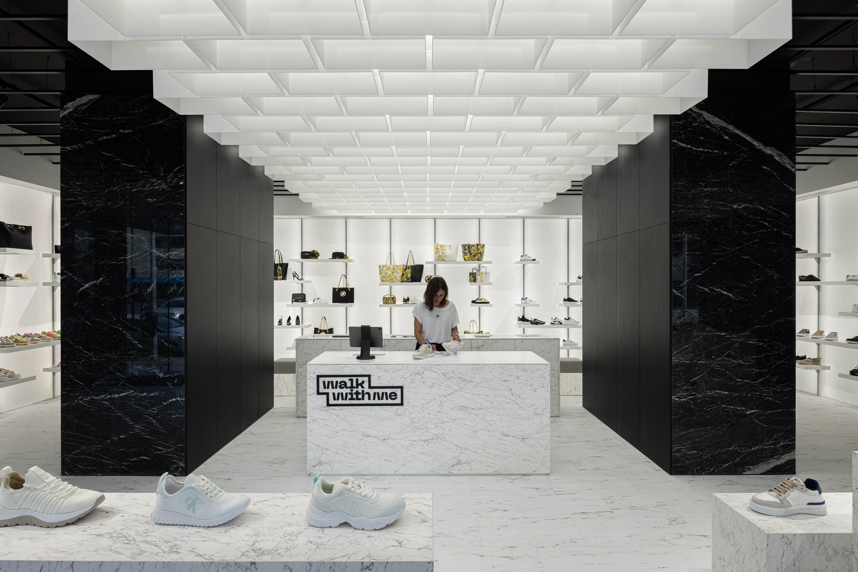
A zona para experimentar calçado é efectuada na parte tardoz do balcão de atendimento, conferindo alguma privacidade e relação directa para o atendimento.
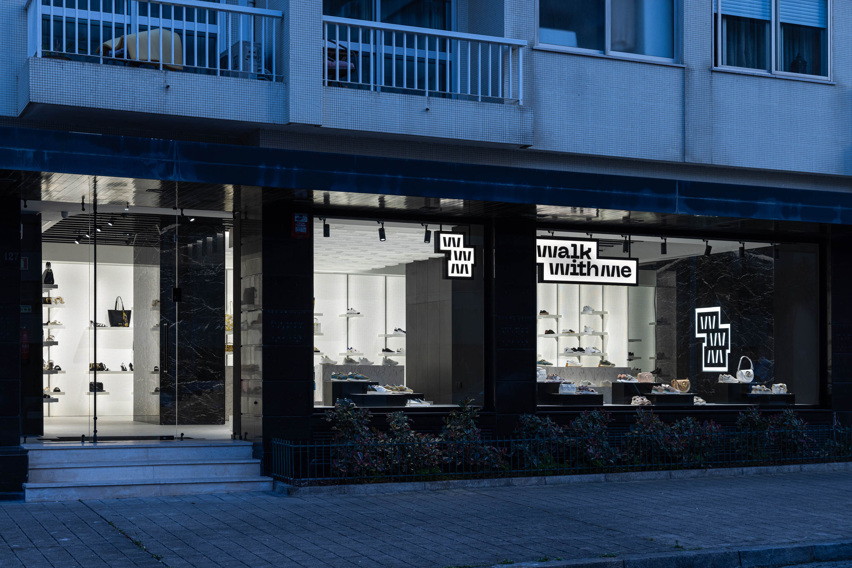
A intenção de dissimular os elementos estruturais tornou-se uma oportunidade para centrar a zona de atendimento, permitindo induzir a um circuito/percurso perimetral na loja, proporcionando aos clientes uma experiência fluída e sequencial no seu percurso.
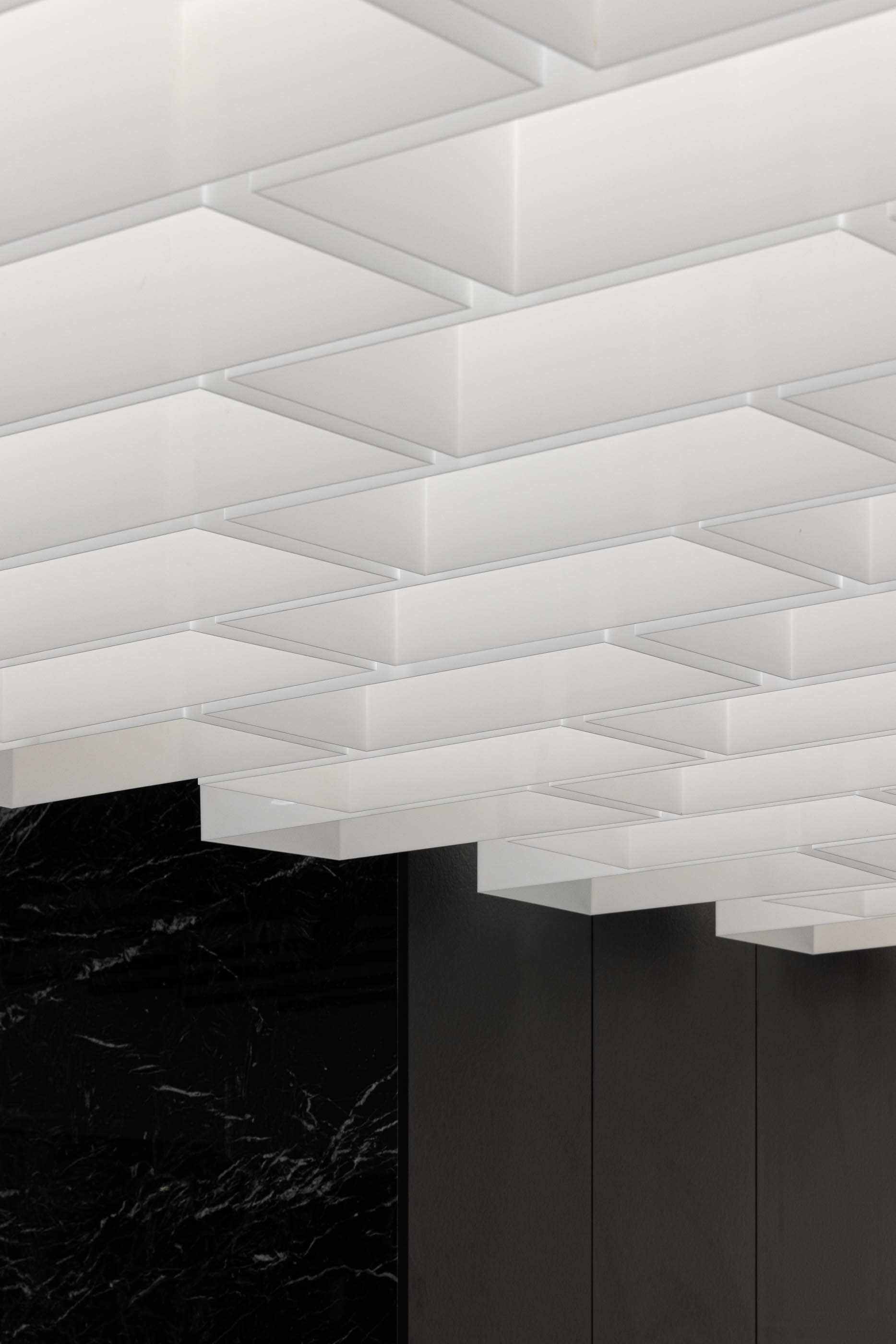
Tendo em conta que o espaço destinado ao público tem uma configuração em rectângulo, com o lado maior exposto à rua, introduzimos um elemento identitário no tecto através de caixas de acrílico vazadas que nos reportam para a métrica do estereotomia do pavimento existente, com forte relação para o exterior e especial destaque para o núcleo da loja - o balcão de atendimento."
O nome “Walk With Me” levou-nos a explorar composições daquilo que é a base do “andar” - O pavimento, e a sua estereotomia, que se tornou a essência do conceito estético-espacial. Partindo desta premissa, estudamos a estereotomia do pavimento cuja métrica permitisse dar origem aos elementos expositivos. Estes elementos, enquanto base para exposição de produto, são um alto relevo da dimensão de cada peça de pavimento (com alturas diversas), possibilitando várias composições mediante quantidade de produto a expôr e/ou novas coleções.
A definição cromática e matérica do espaço, é sugerida pelo logotipo da marca, em que exploramos materiais pétreos pretos e brancos, através de texturas de mármore calacatta e marquina. Esta dualidade cromática permite que os produtos tenham natural destaque no espaço, enquanto elementos compositivos do mesmo. O branco está sempre associado ao produto, e por seu lado o preto está associado às zonas/partes/elementos “estéreis” da loja.
O critério para a exposição de parede passava por um sistema que também permitisse diversas composições, mas também iluminar os produtos de forma homogénea, pelo que propusemos painéis retro-iluminados compostos por acrílico opalino branco e chapa perfurada. Foram definidas duas tipologias de estante para este sistema, “single” e “tripla”, permitindo diversas combinações nas triplas e destaque de produto na single.
A zona para experimentar calçado é efectuada na parte tardoz do balcão de atendimento, conferindo alguma privacidade e relação directa para o atendimento.
A intenção de dissimular os elementos estruturais tornou-se uma oportunidade para centrar a zona de atendimento, permitindo induzir a um circuito/percurso perimetral na loja, proporcionando aos clientes uma experiência fluída e sequencial no seu percurso.
Tendo em conta que o espaço destinado ao público tem uma configuração em rectângulo, com o lado maior exposto à rua, introduzimos um elemento identitário no tecto através de caixas de acrílico vazadas que nos reportam para a métrica do estereotomia do pavimento existente, com forte relação para o exterior e especial destaque para o núcleo da loja - o balcão de atendimento."
"In this project, as the inaugural space for a new retail footwear brand, the primary goal was to establish a unique identity through the interpretation of the brand's name, the product line to be marketed, and the target audience.
The name "Walk With Me" inspired us to delve into the composition of what underlies the act of "walking" - the flooring, and its stereotomy, which became the essence of the aesthetic-spatial concept. Starting from this premise, we examined the stereotomy of the flooring, seeking a metric that would give rise to the display elements. These elements, serving as the foundation for product presentation, are high-relief representations of the various dimensions of each flooring piece, enabling diverse compositions depending on the quantity of products to be exhibited and/or new collections.
The chromatic and material definition of the space is suggested by the brand's logo, where we explore black and white stone materials, using textures of Calacatta and Marquina marble. This chromatic duality allows the products to naturally stand out in the space as integral compositional elements. White is consistently associated with the products, while black is linked to the "sterile" zones/parts/elements of the store.
The criteria for the wall display involved a system that not only allowed for various compositions but also provided even illumination of the products. To achieve this, we proposed backlit panels composed of white opaline acrylic and perforated metal sheets. Two types of shelves were defined for this system, "single" and "triple," offering multiple combinations in the triple configurations and product highlights in the single shelves.
The area for trying on shoes is located at the rear of the service counter, providing some privacy and direct interaction with the staff. The intention to conceal structural elements presented an opportunity to centralize the service counter, encouraging a perimeter-circulation layout within the store. This design creates a smooth and sequential shopping experience for customers.
Given that the public area of the space has a rectangular configuration, with the longer side facing the street, we introduced an identity element in the ceiling with hollowed acrylic boxes. These boxes harken back to the metrics of the existing flooring's stereotomy, establishing a strong connection to the exterior and giving special prominence to the core of the store - the service counter."